Aparna
Published on
05 - 25 - 2019
Aparna
Published on
05 - 25 - 2019
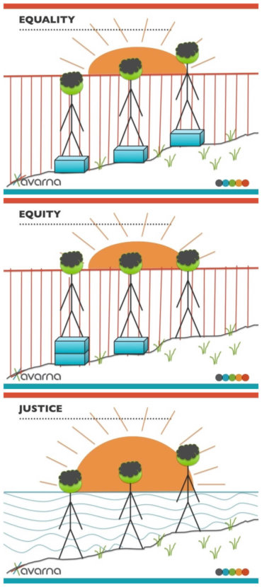
We wanted to tell you the story of why we decided to create yet another equality v. equity (v. justice) image series, which you can access here.
For those of you who have been engaged in some conversation about equity in the past ten years, you inevitably have come across some version of the equity v. equality image – the one with a fence, people, and boxes. And if you scratched the surface of the Internet to learn about these images, you would also know that there have been many, many iterations, think pieces, and critiques of these images.
The image below probably looks familiar; it was the first one we came across and was widely circulated across the internet (authored by Craig Froehle).
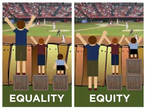
In the picture on the left, three people want to watch a baseball game, but they cannot all see the game because they are all different heights and a fence blocks their view. Equality is about treating them all the same and giving them a box to stand on. But alas, even with a box, the shortest person can’t watch the game.
Enter equity. Equity means redistributing the boxes so that all three people can watch the game (yay!). You could watch lightbulbs go off when we showed people this image.
Despite the usefulness of the image, many also pointed out its shortcomings. On a surface level, wanting to watch the baseball game doesn’t really resonate with everyone. And though we’ll never find an activity that will resonate with everyone, this centering of Americana seemed antithetical to equity efforts. Second, the three people are different heights, which implicates the person—and not the fence (the system)—for their inability to all watch the baseball game. This would be akin to telling someone that the reason they cannot afford a college tuition is not classism (the system), but the fact that they just haven’t worked hard enough to afford it.
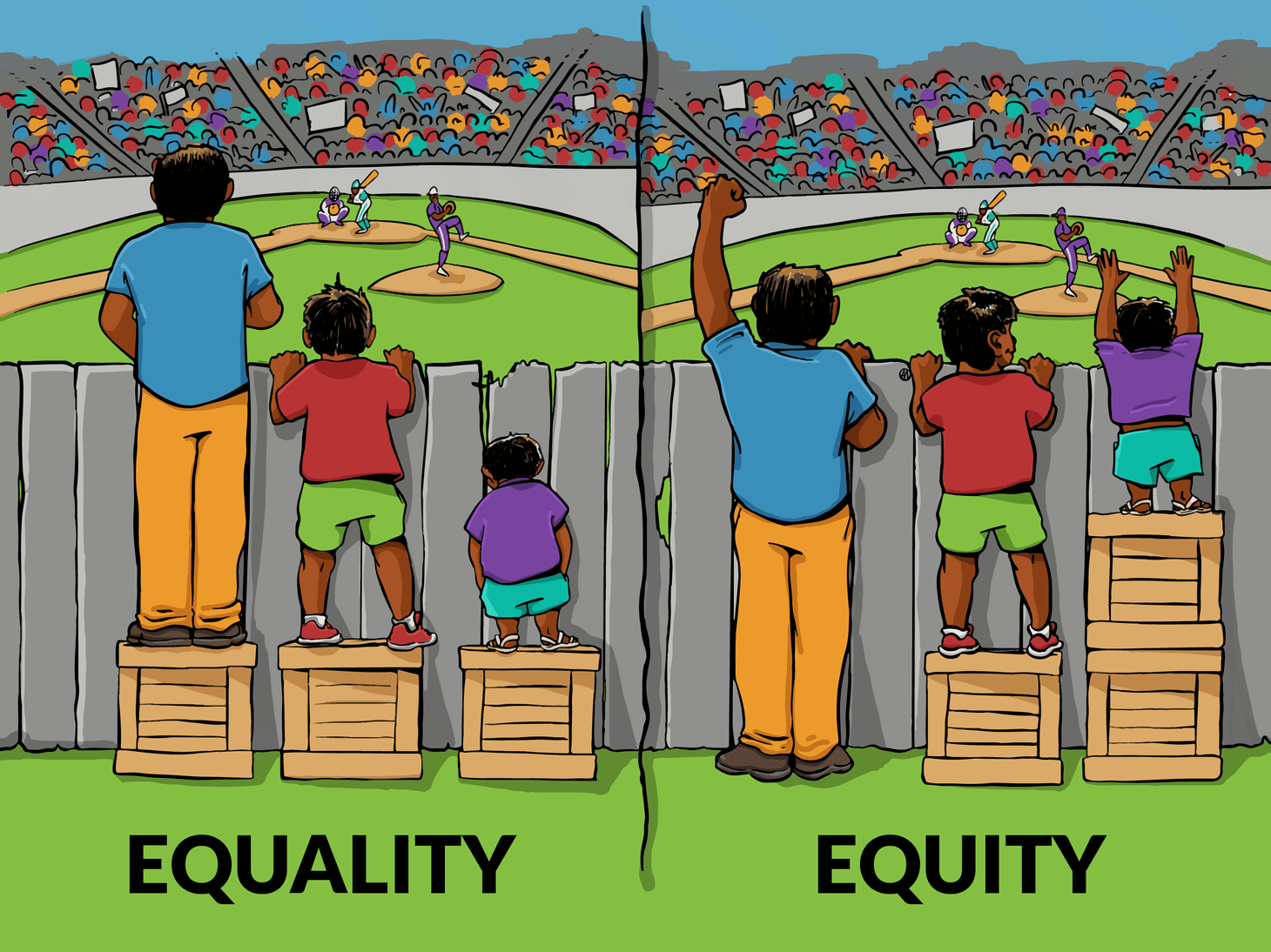
Since the initial critiquing of these images, here have been countless re-interpretations. This version created by Angus Maguire for the Interaction Institute for Social Change adds a specific race lens to the images.
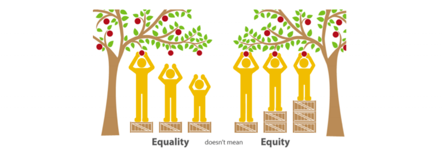
And then the Office of Health Equity in Maine decided to switch the baseball game out for a fruit tree, and added a few more boxes or a ladder (which then missed the entire point of redistributing resources).
And yet another artist decided to throw people out the door, and use flowers instead. Which is great, but then we’re no longer talking about social justice but . . . plant justice, perhaps? And this removes us further from the human element of equity work.
The bottom line is that there are so many versions of this image out there. And for whatever reason, this tableau—three people wanting to see something, a fence in the way, and boxes helping them— has been a successful tool for people to understand that equality means something very different from equity.
So why yet another image? We wanted to create an image that accomplished a few things:
We know that version 78.2 bajillion of this image still is not be perfect, but it does reflect our learning and the feedback that other images have received. The point is that the work of justice, equity, diversity and inclusion is ever evolving, and the symbols and metaphors we use to educate people about the work should too.
So please feel free to use this set of images (with attribution please). And if you have some feedback for us on our image, please let us know. And finally, if we’re lucky, perhaps you will be inspired to create something even better; if so, send it to us!
Sources
Dear Avarna community, We’re only four months into four years of this presidential administration, and the attacks on everything our…
Read full post about Staying the Course: On EOs, Education, ERGs, and SailingAvarna Community, It is with nearly all the emotions you might find in an emotions wheel that I am announcing…
Read full post about Farewell, AvarnaThe current administration’s anti-DEI Executive Orders have sparked varied responses in the nonprofit and private sectors—some organizations are defending DEI…
Read full post about DEI Jujitsu: Flipping the Backlash to Reframe Our Work